
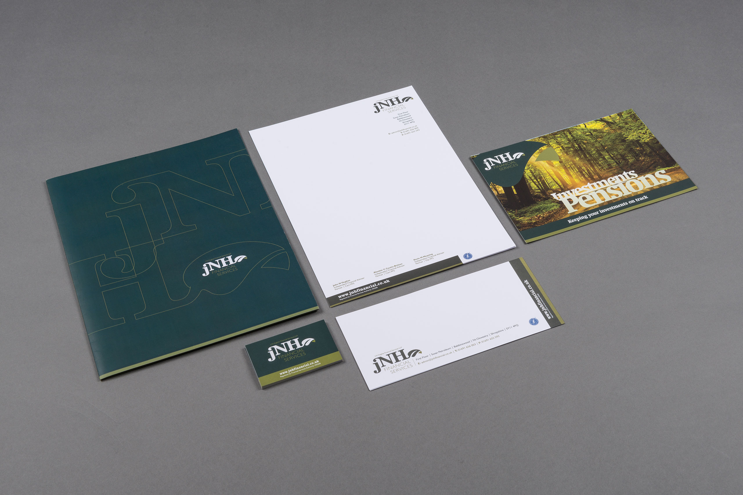
JNH Financial
CLIENT: JNH Financial
EMPLOYER: Pop Creative
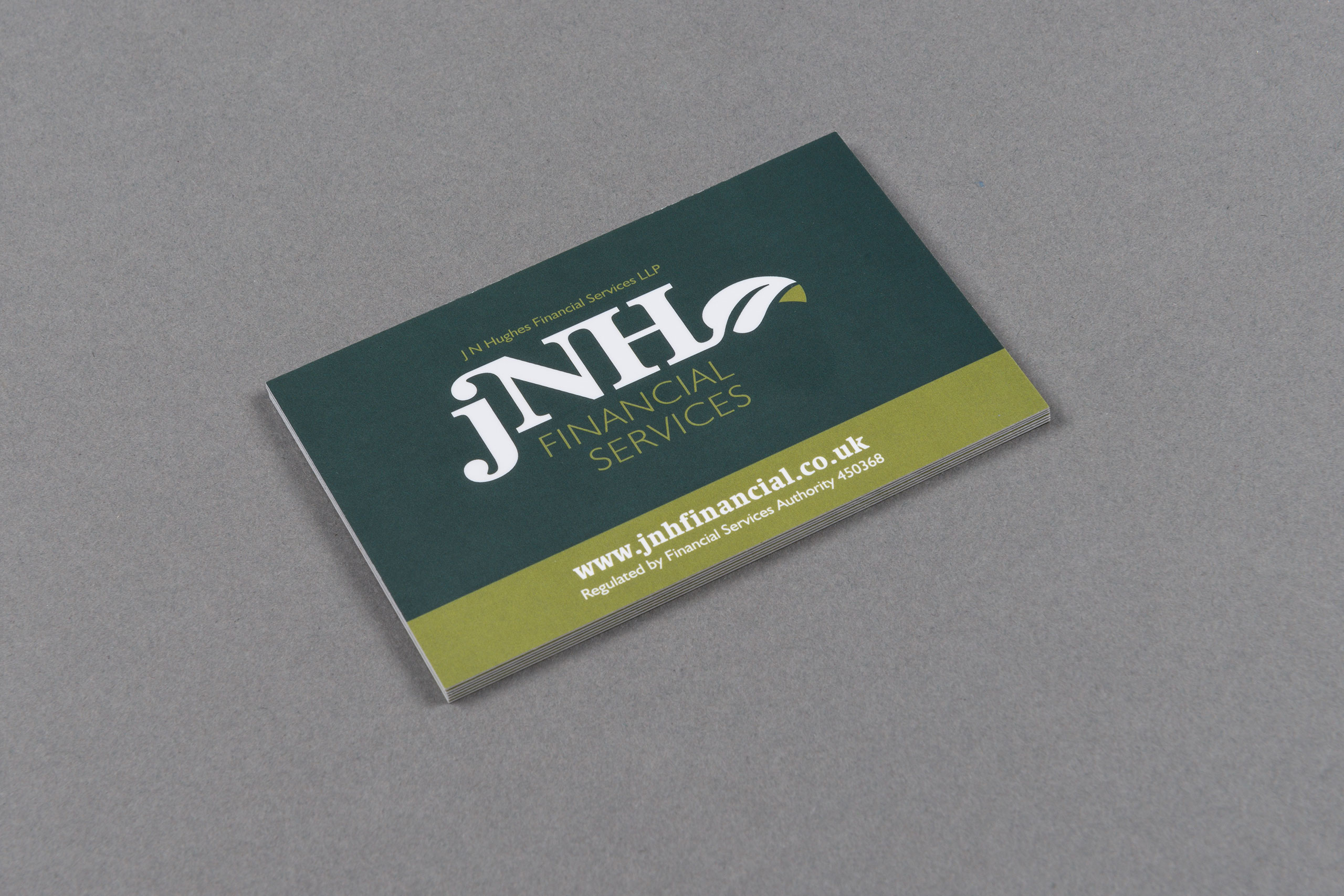
BRIEF: JNH Financial wanted to raise the companies profile to a particular demographic whilst maintaining a natural element to their identity.
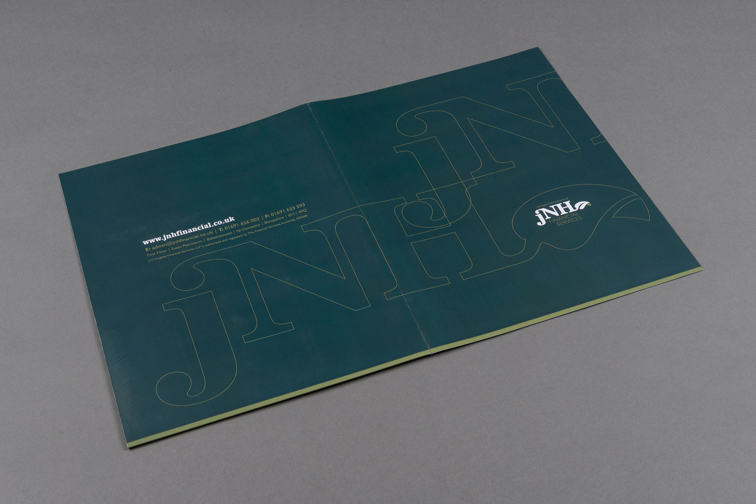
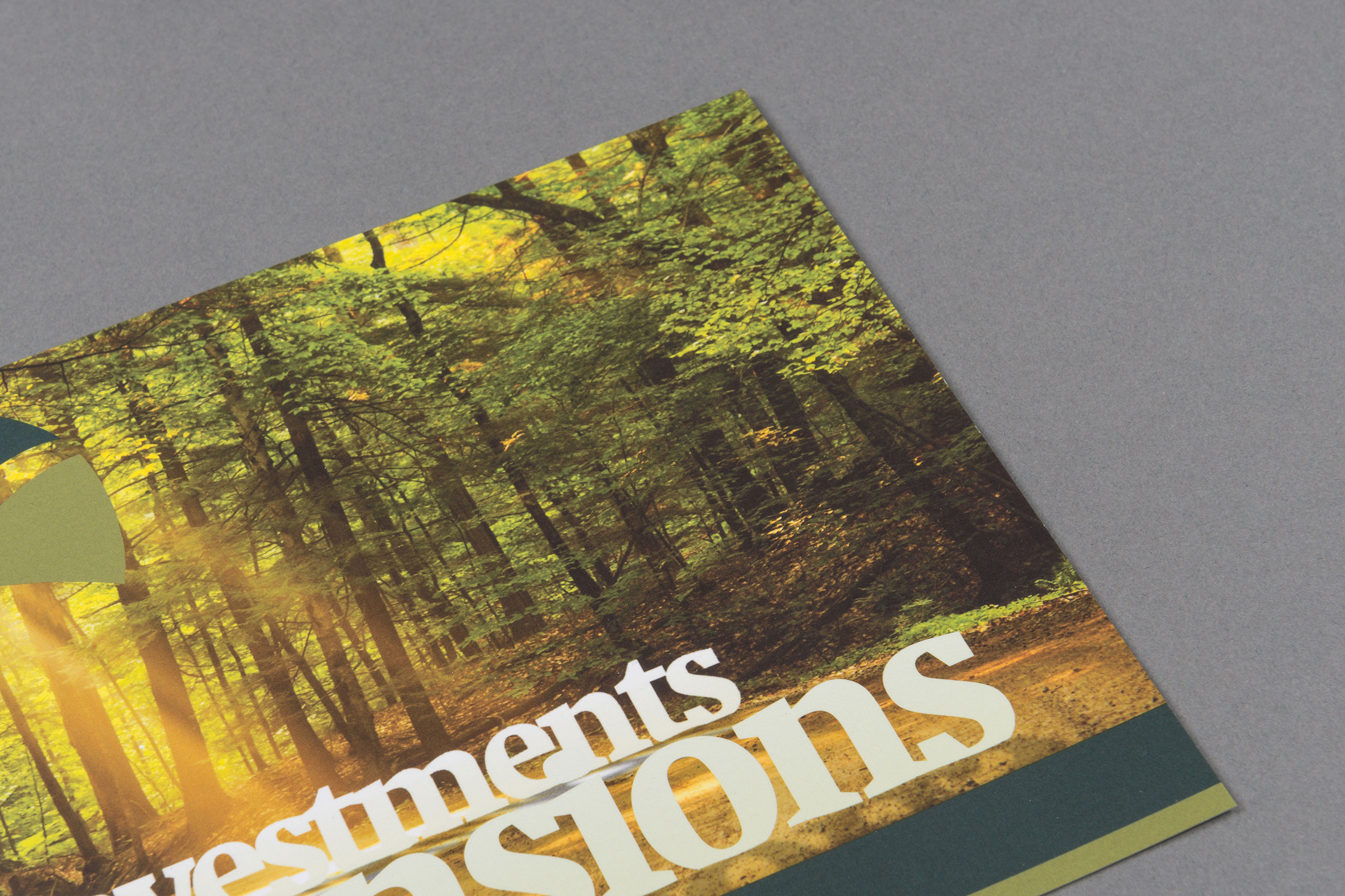
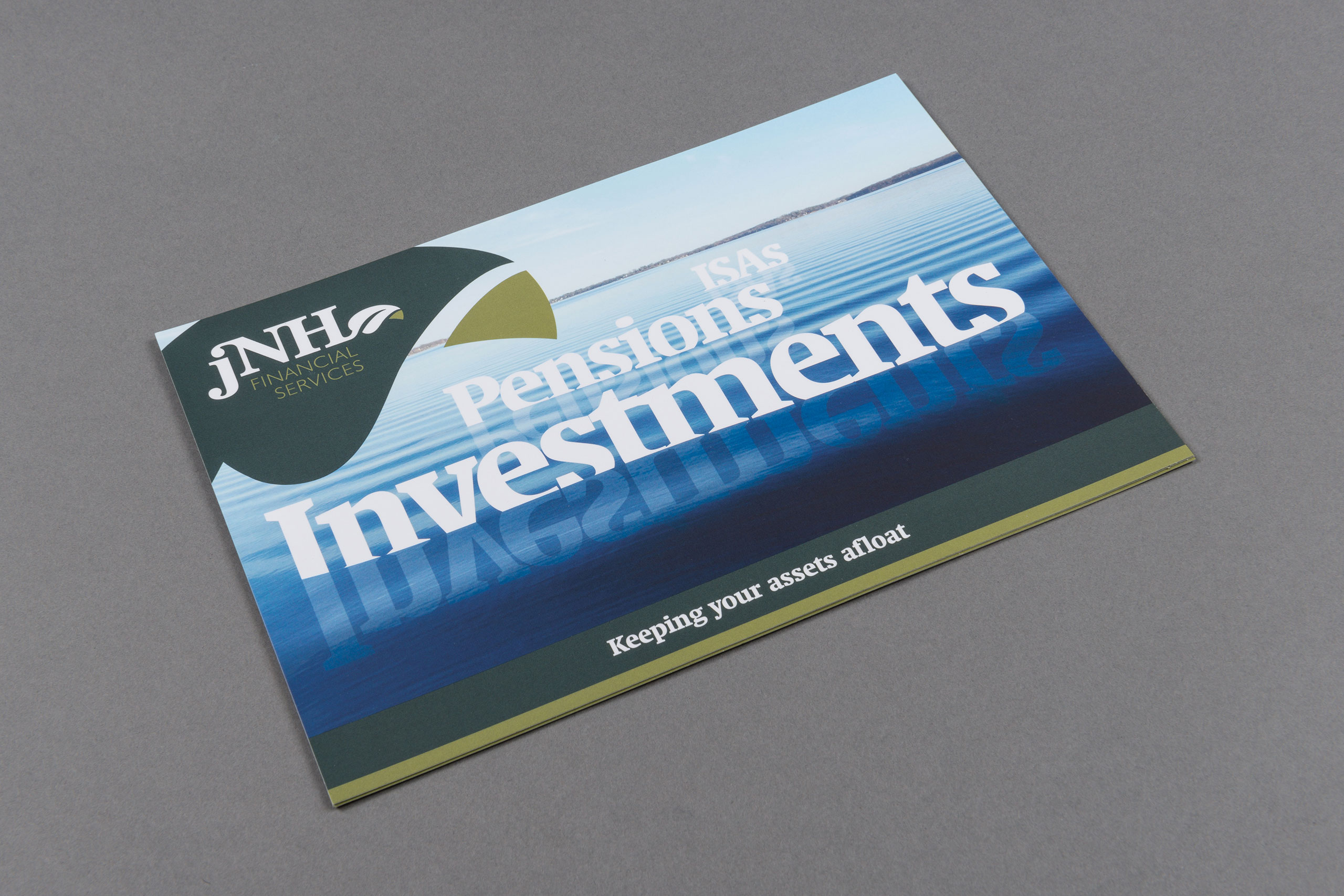
SOLUTION: Classical typography and the associations made with money and trees led to the logo design and colour palettes. Imagery was picked to reflect the county of Shropshire where the main customer base of the firm reside, and led to the marketing messages – “Keeping your investments on track” and “Keeping you’re assets afloat”.