



CLIENT: Shropshire County Pension Fund
EMPLOYER: Pop Creative
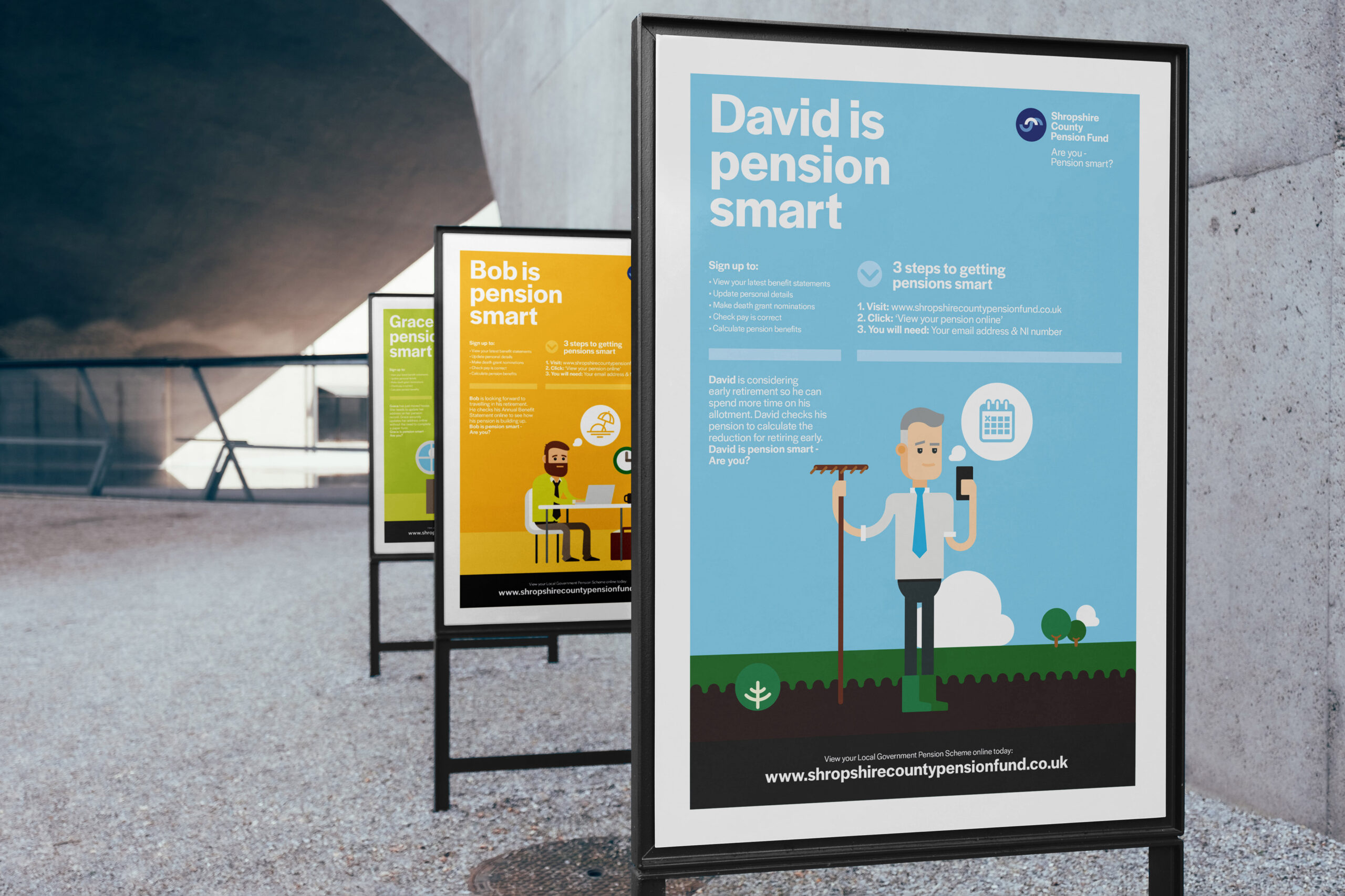
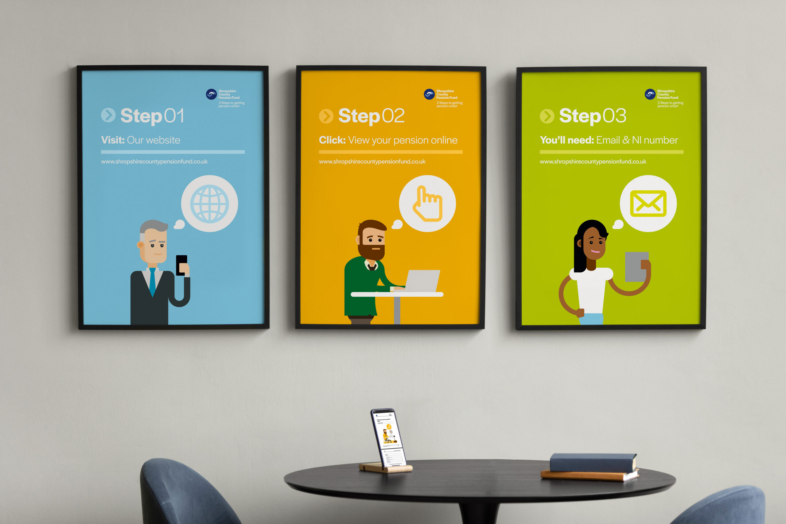
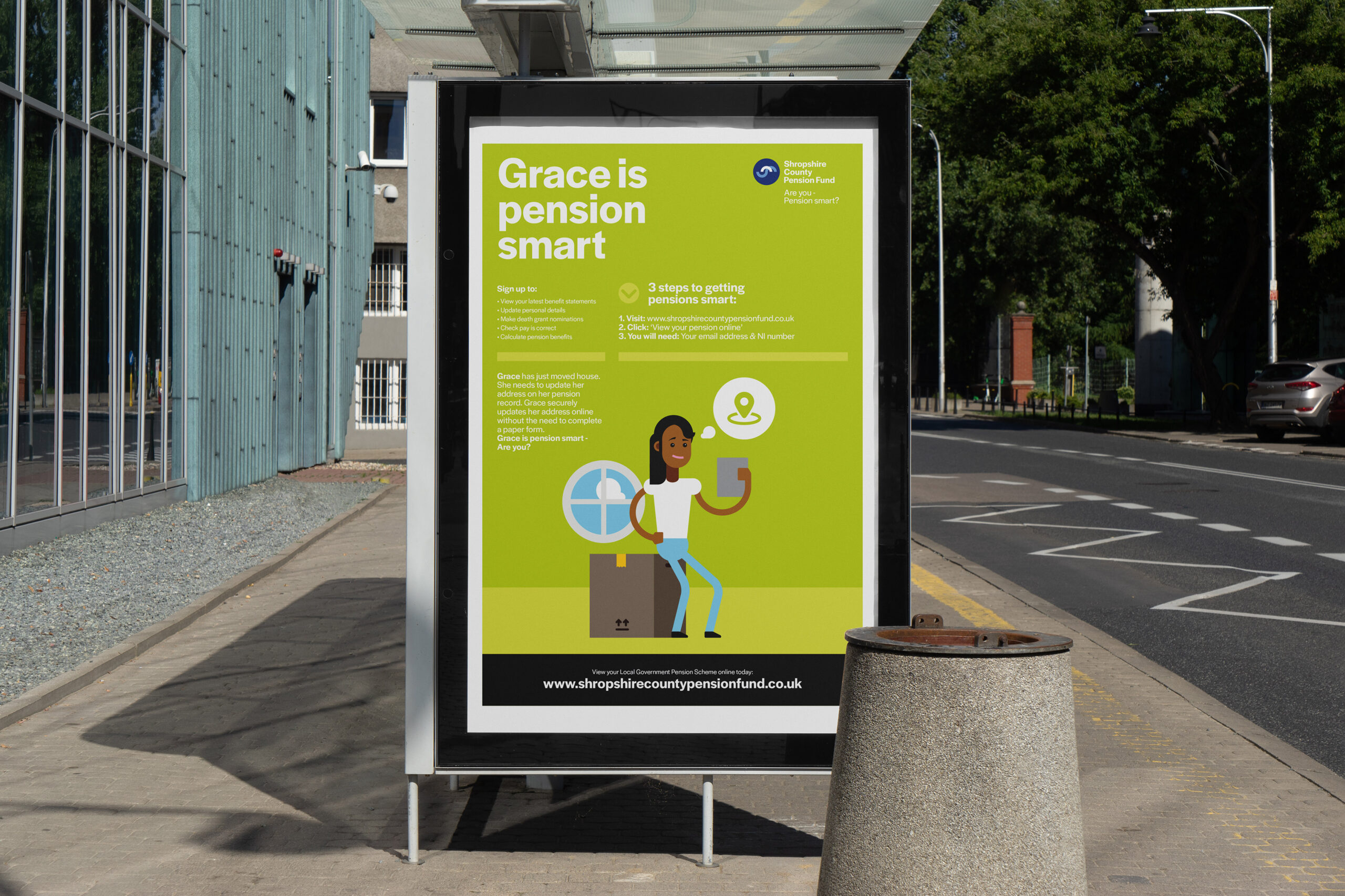
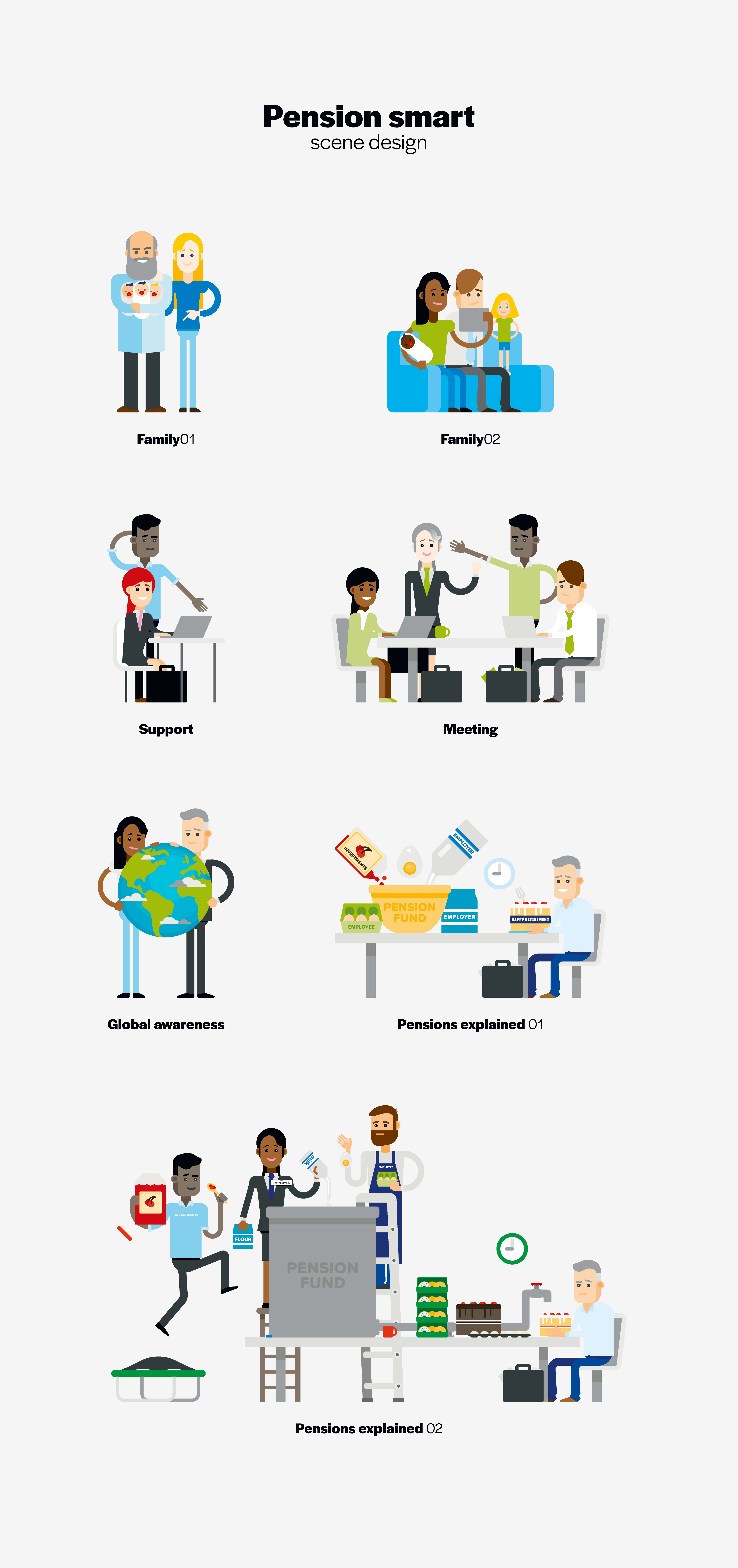
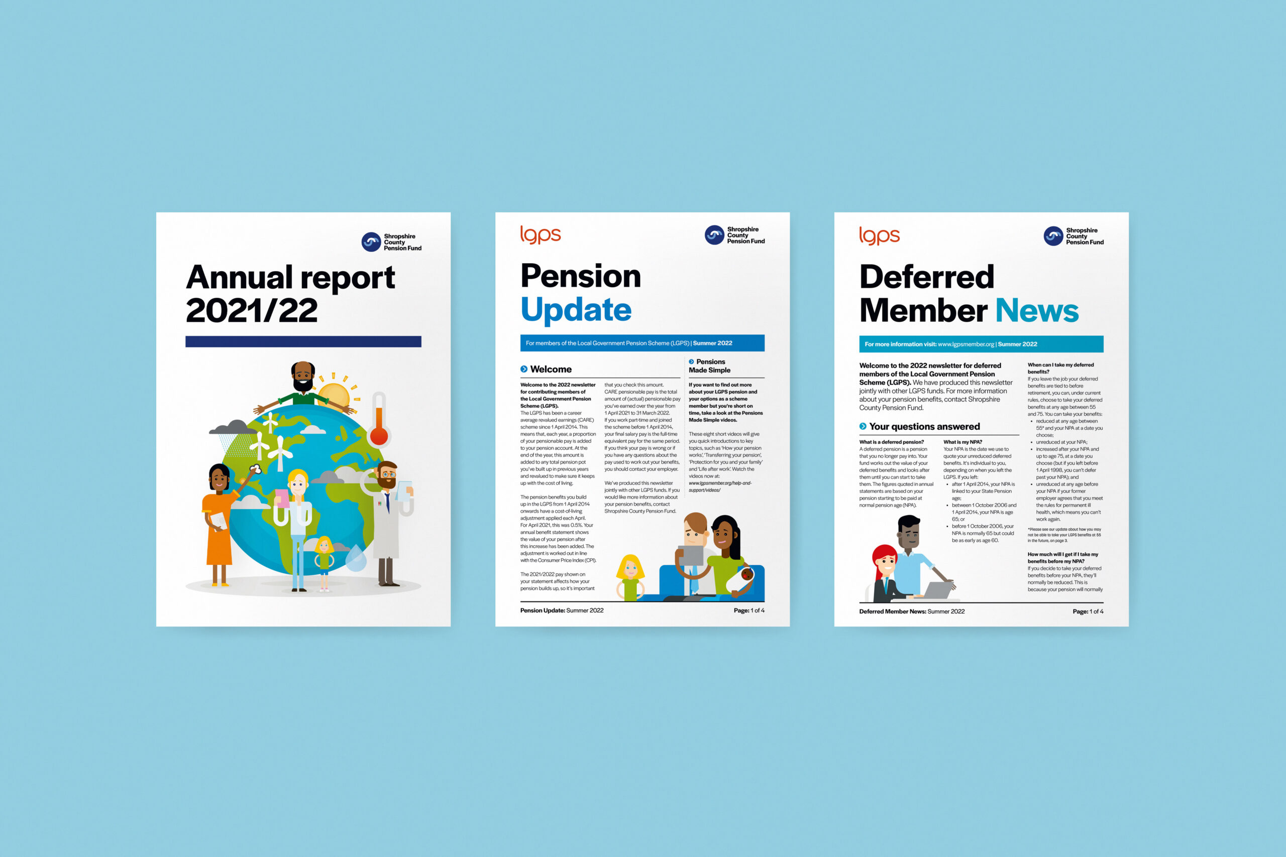
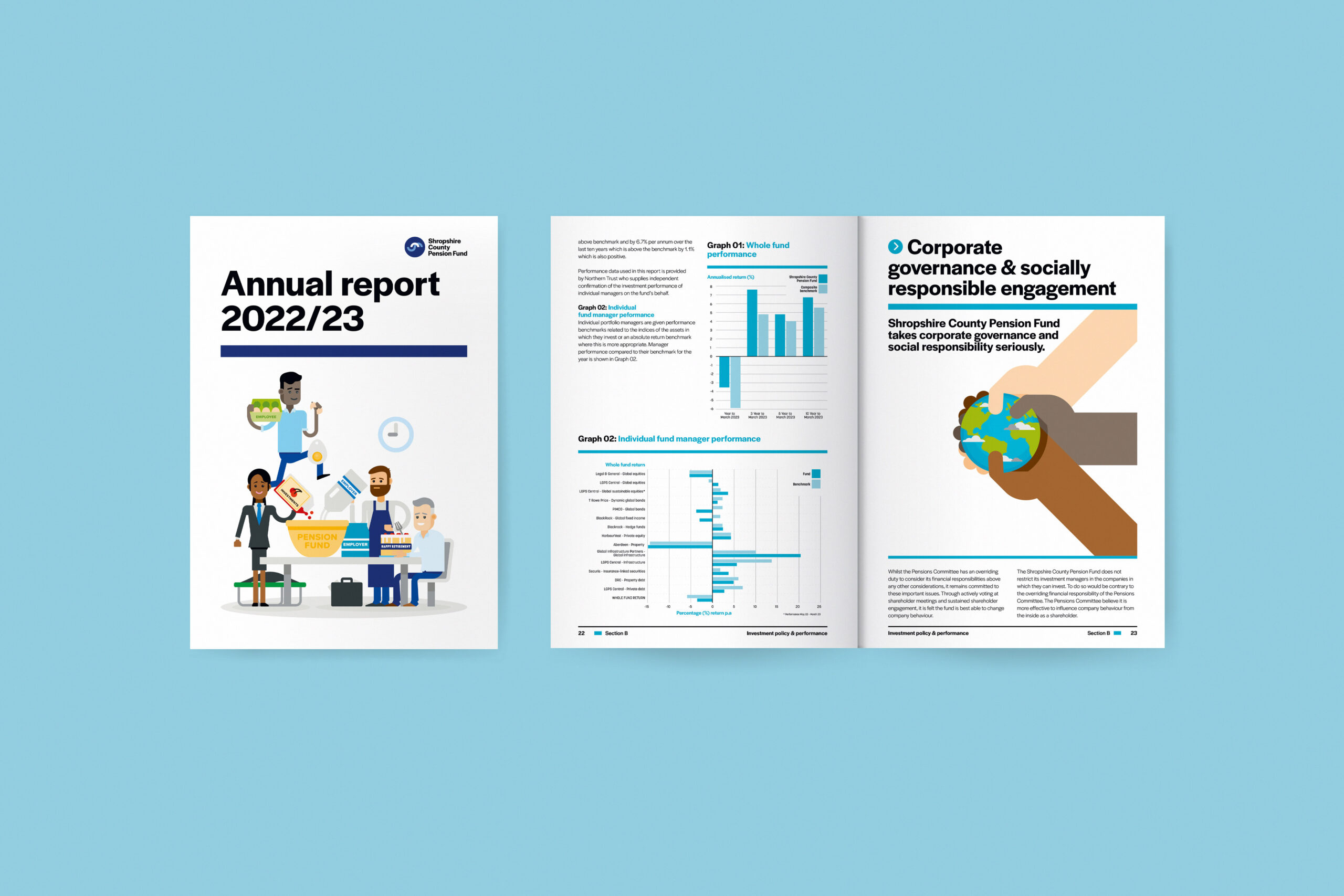
BRIEF: To update the look and feel of Shropshire County Pension Fund’s communications and introduce illustrated characters and scenes to help people to get to grips with their pensions. Also needed to enable documents created in-house to fit with the graphic language of the new brand and maintain existing customer trust. Whole project needed to come together as part of the ‘Are you pension smart?’ campaign release, which aimed to get people to start using online avenues to taking control of their pensions.
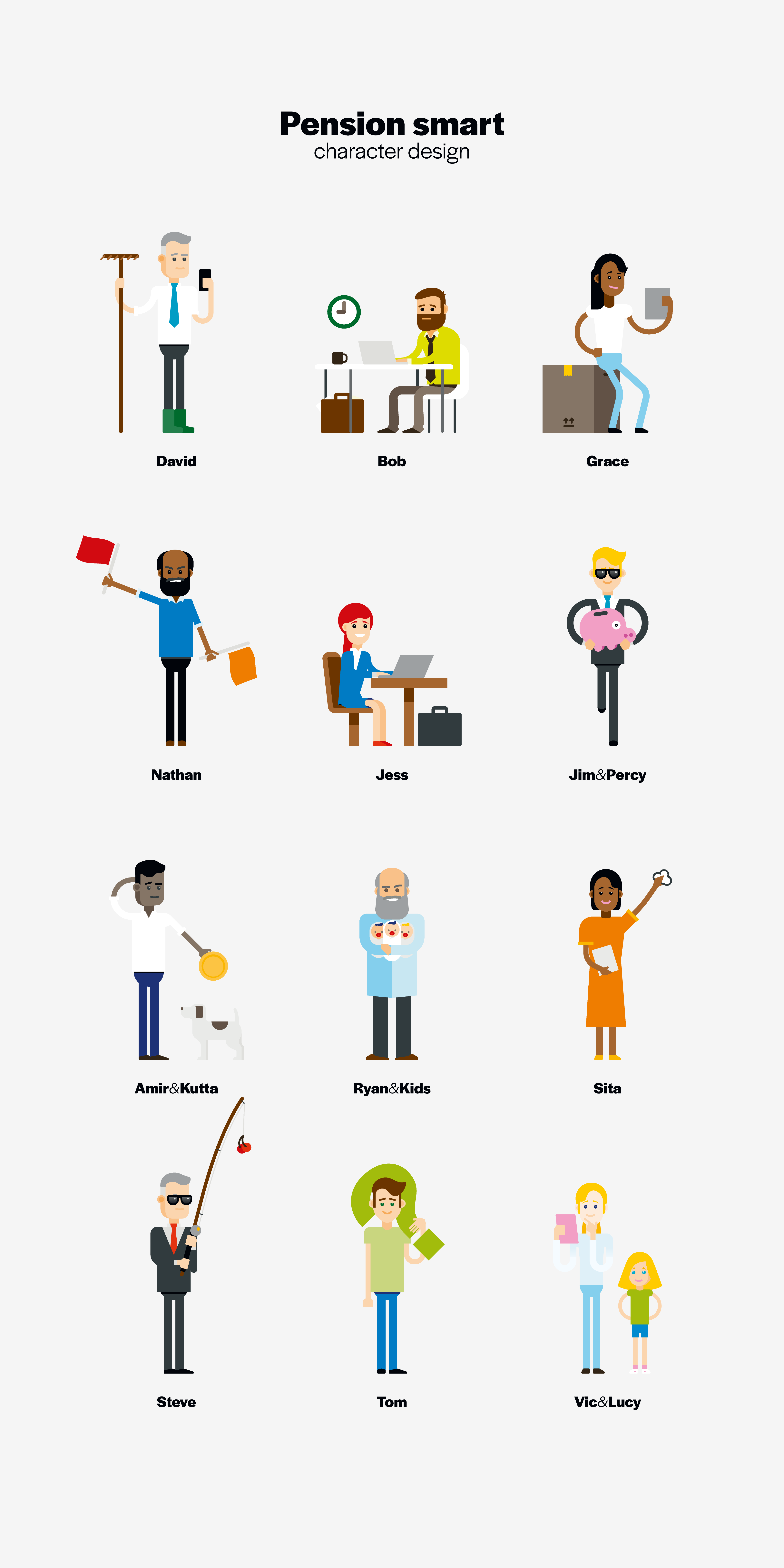
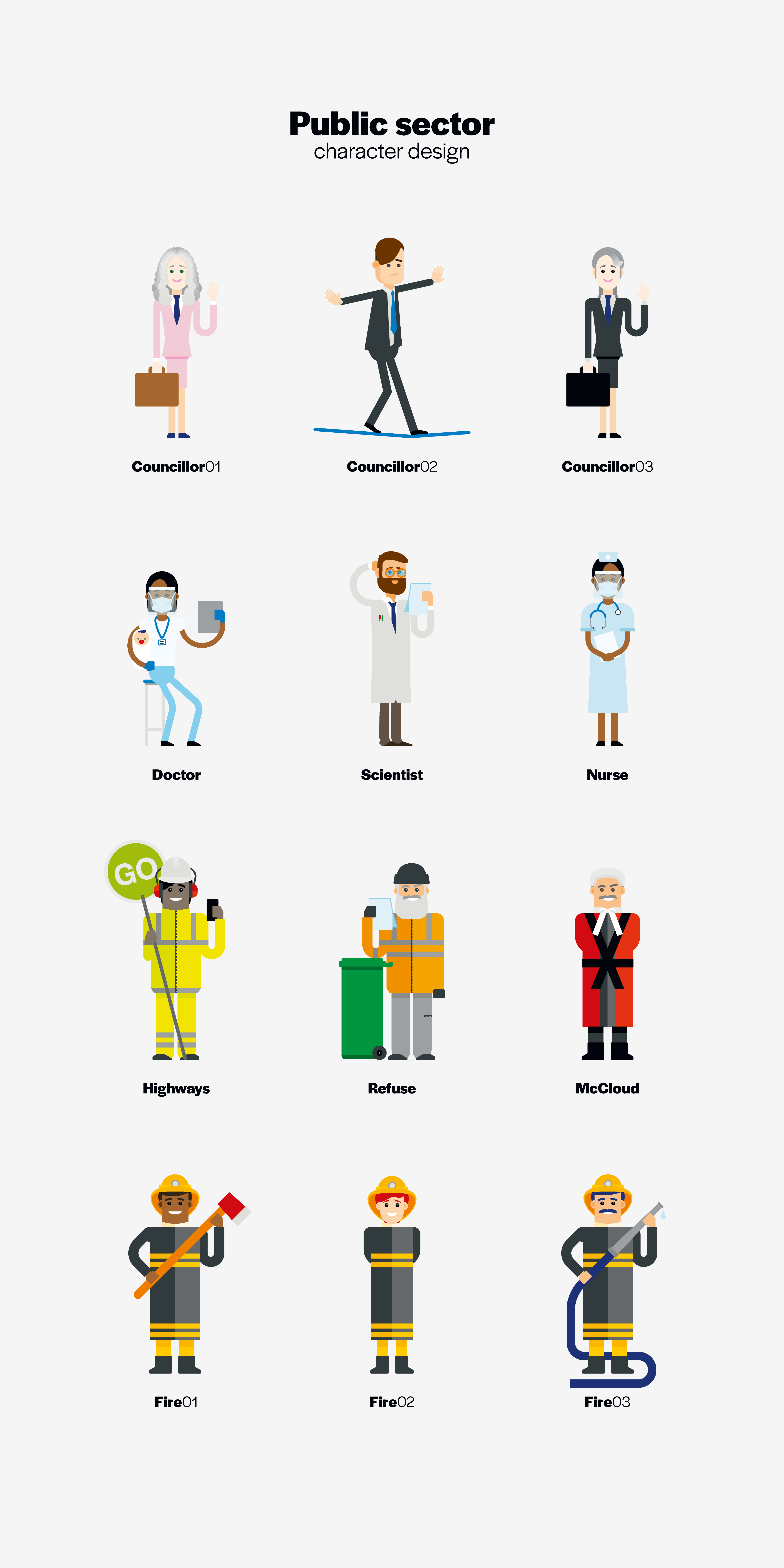
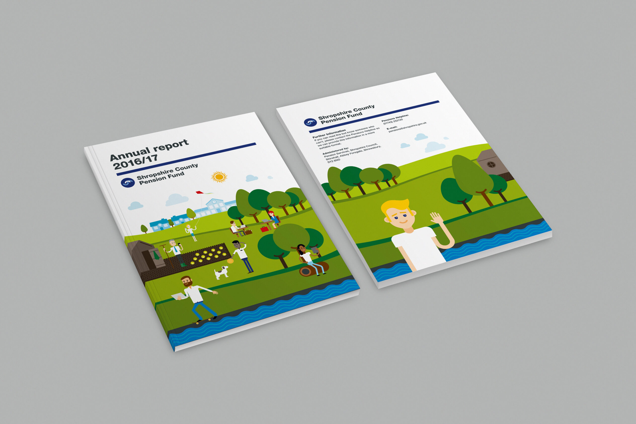
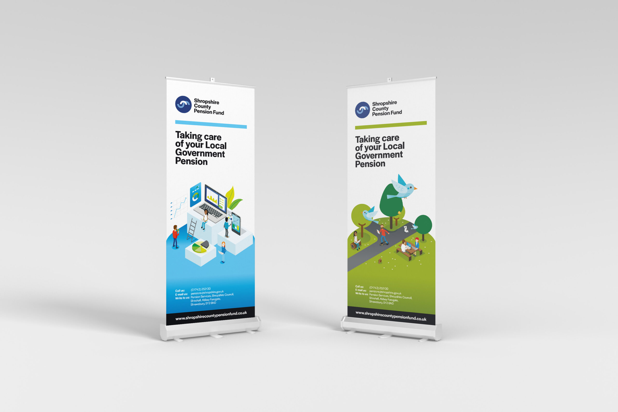
SOLUTION: Logo converted to a flat graphic design with fonts and colour palette hierarchy adapted to meet in-house production requirements. Illustrations developed to mirror the flat graphic logo with friendly characters designed in a way that meant they could be manipulated and changed in a timely manner and on budget. Scenes were briefed by the client and Boldesign left to create eye catching and communicative solutions. Word and power point documentation was also templated in a way that meant designer and in-house publications all followed the same visual language and strengthen the overall brand and its publications.