BLOG

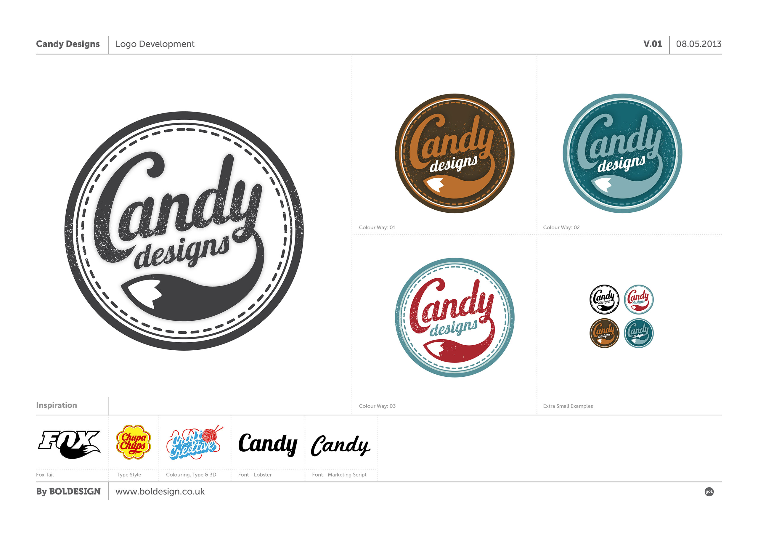
Here is the design development for the new logo commissioned by craft business Candy Designs. Useful direction on type styles, colour, circular shape and use of the fox tail were provided whilst additional elements were introduced to add a more ‘crafty’ feel, like the stitching around the inner circle and some grunge splatters to roughen it up a little. The name Candy comes from the woods that the client grew up in (hence the fox tail) so some of the colour ways moved from the initial Candy Sweet colouring that was asked for to more natural palettes.
Boldesign.co.uk is alive!

Please watch this space for updates on latest projects and goings on.