BLOG
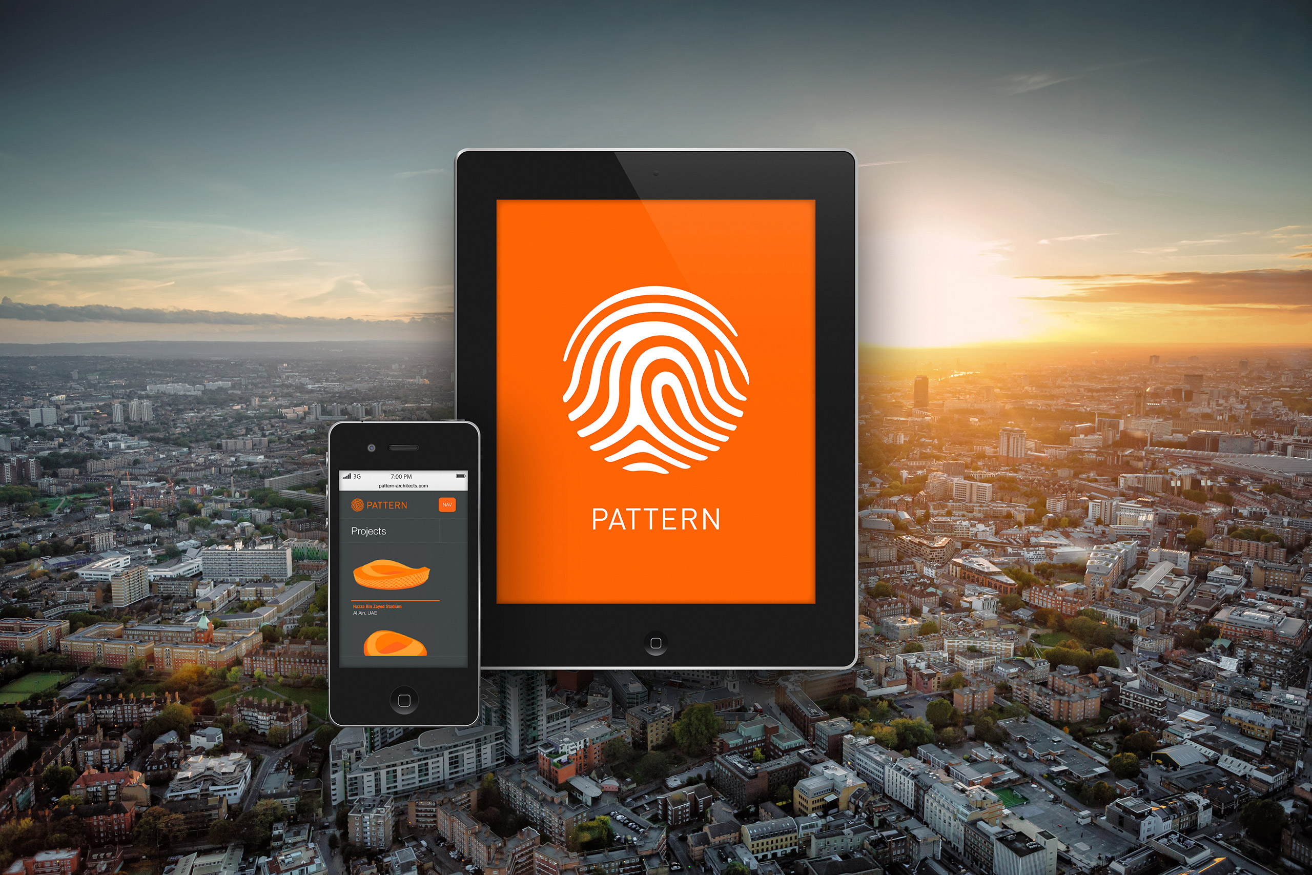
Great new corporate identity and website design for London based Pattern architects. Especially enjoyed illustrating some of their excellent building designs for the projects page of the site. You can see more of this project here: www.boldesign.co.uk/project/pattern-architect
Montgomeryshire Wildlife Trust Branding
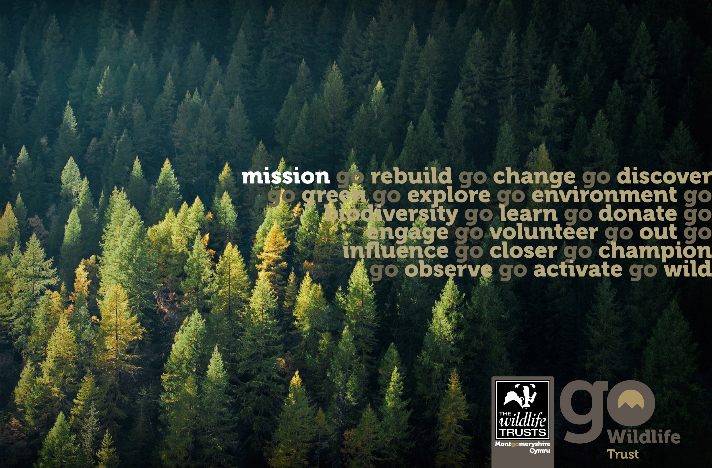
Brand Identity created with Pop Creative for Montgomeryshire Wildlife Trust. Click below to check out the project.
Project: http://www.boldesign.co.uk/project/montgomeryshire-wildlife-trust/
Timber Expo Brochure & Identity
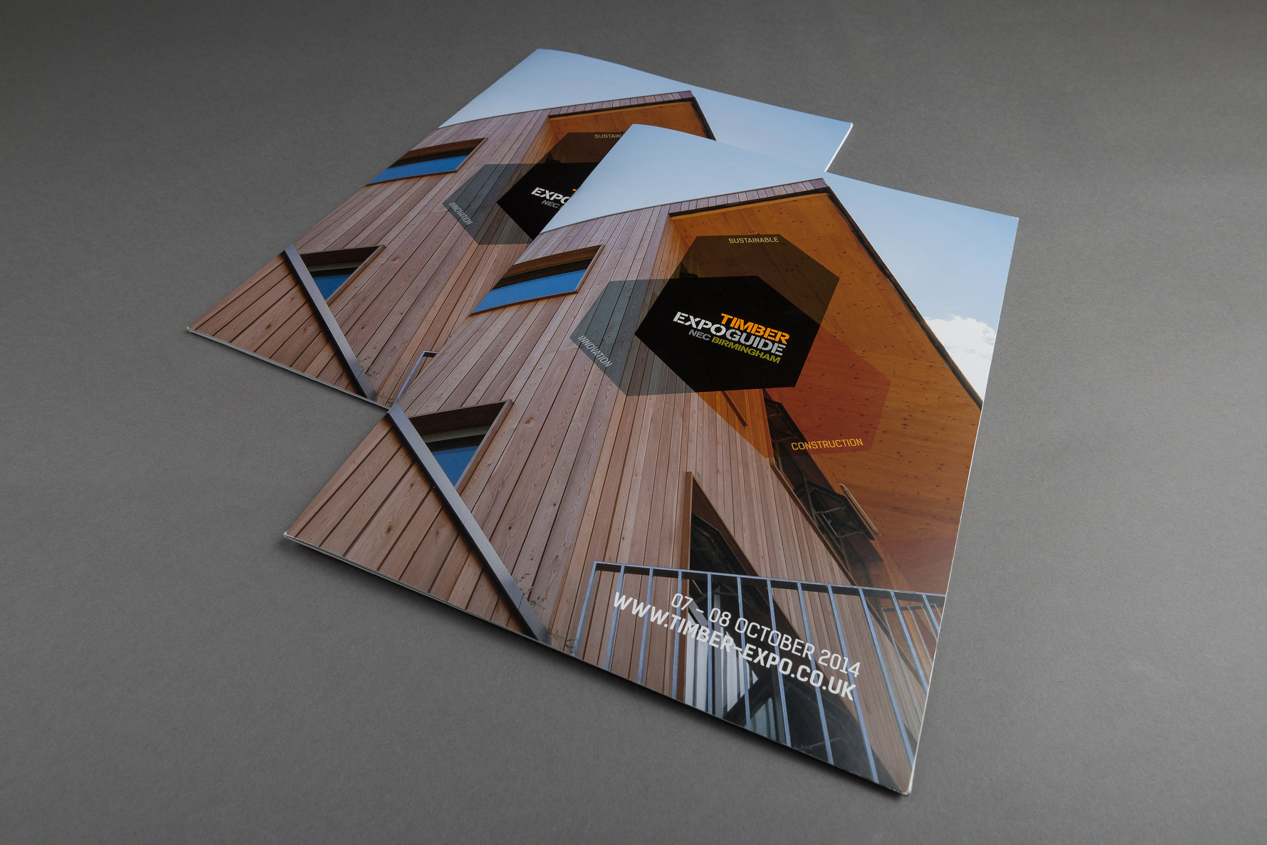
Great opportunity to work on re-vamping the identity of Timber Expo, ‘the most important event on the UK construction calendar dedicated exclusively to timber,’ starting with the re-design of it’s brochure.
Check out more of the project here: http://www.boldesign.co.uk/project/timber-expo/
For more information on Timber Expo visit: www.timber-expo.co.uk
Point of Sale Concept Artwork
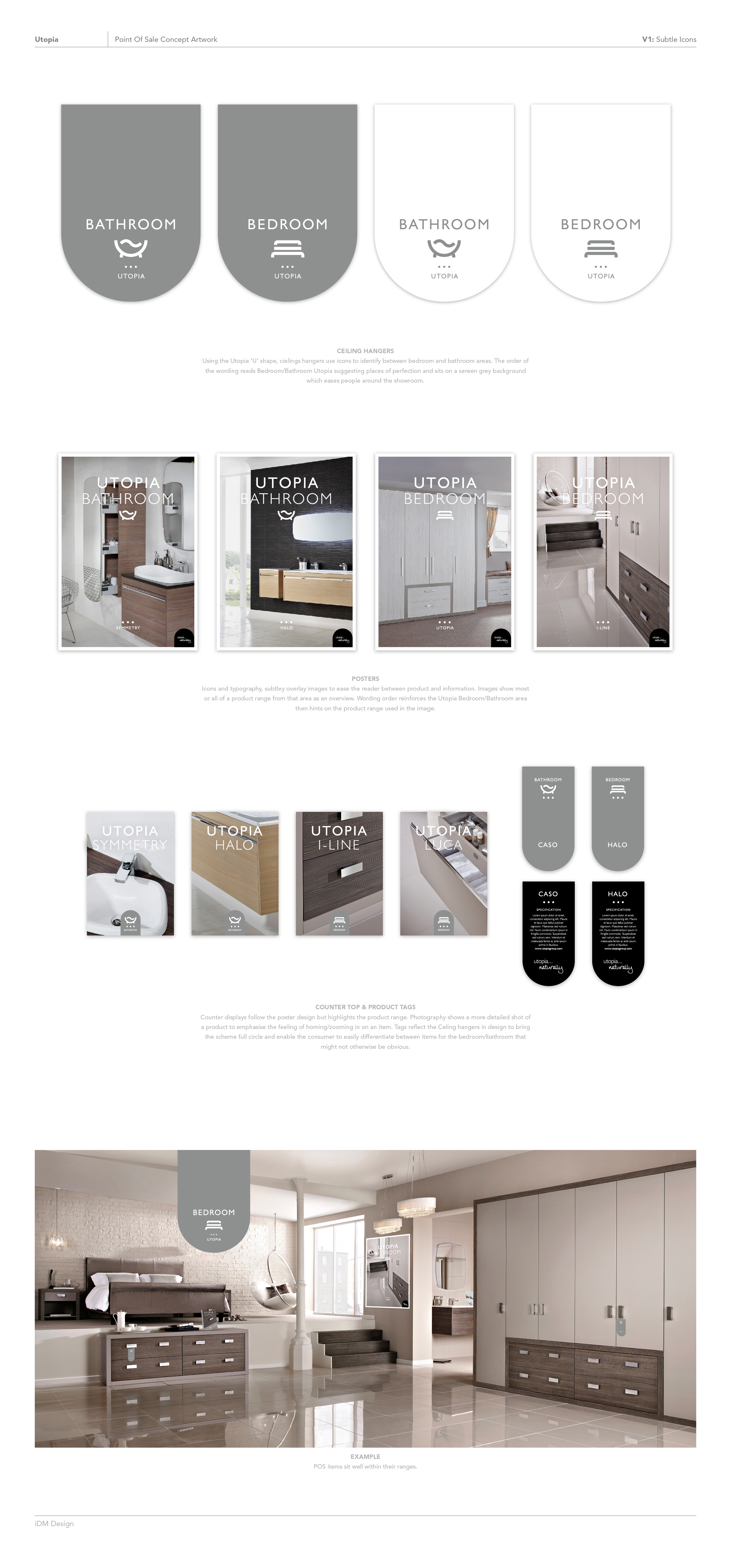
Freelance design concepts for IDM Design. Simple and cost effective POS designs presenting a modern, stylish image for Utopia stores in keeping with their current branding.
H.Curteis Silver branding & product catalogue
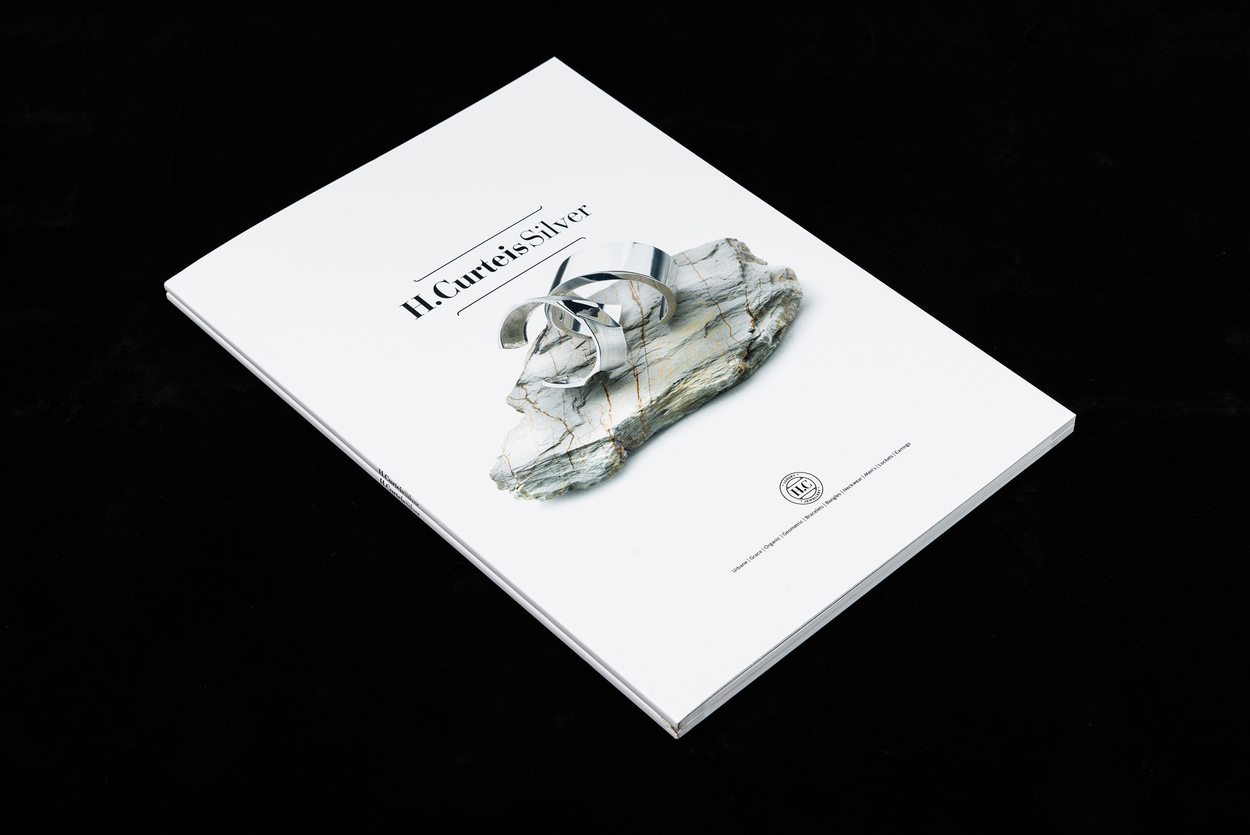
Designing for Pop Creative we created a full brand identity and product catalogue for luxury jewellery line H.Curteis Silver.
Project: http://www.boldesign.co.uk/project/h-curteis-silver/
WOODLAND RESIDENTIAL CARE HOME LTD

New Branding and Website Design for Woodland Residential Care Home. Please see link below to view the project.
View Project: http://www.boldesign.co.uk/project/wooodland/
Company Website: http://www.woodlandcare.co.uk
Candy Designs, a crafty logo.
Here is the design development for the new logo commissioned by craft business Candy Designs. Useful direction on type styles, colour, circular shape and use of the fox tail were provided whilst additional elements were introduced to add a more ‘crafty’ feel, like the stitching around the inner circle and some grunge splatters to roughen it up a little. The name Candy comes from the woods that the client grew up in (hence the fox tail) so some of the colour ways moved from the initial Candy Sweet colouring that was asked for to more natural palettes.